
Green Screen Chroma Key: How to Key Cleanly on Any Editor (2026)
Why a chroma key looks clean in the preview and ugly in the export
You light the screen, drop the clip on the timeline, pull the chroma key, and it looks fine. Then you watch the export on a TV and there’s a green rim around your shoulders, a ghost of the screen along your hair, and the grey sweater you wore has half vanished. Nothing about the shot changed. What changed is which pixels you looked at, and what the chroma key was comparing.
A chroma key isn’t a wand that removes green. It measures how far each pixel’s colour sits from a reference colour, then decides how transparent that pixel should be. Here’s what this guide covers:
- What a chroma key compares, and the part of the picture it ignores completely
- The similarity window, and how much uneven lighting quietly steals from it
- Whether 4:2:0 really breaks a chroma key (measured: on a flat screen, it doesn’t)
Every number below comes from FFmpeg 7.1.5 driven from Python, against a synthetic 1280×720 green screen with a white card and a skin patch. Each figure is a pixel count read back from the frame, so you’ll get the same result from the commands at the end. There are no timing claims, because this container reports 64 CPUs while its cgroup quota is 2. Pixel counts don’t care about load.
What a chroma key actually compares
A chroma key holds a reference colour, your screen green. For each pixel it converts the colour into its chroma components, Cb and Cr, and measures the distance between that pixel’s chroma and the screen’s chroma. Small distance means “this is screen, make it transparent”. Large distance means “this is your subject, keep it”.
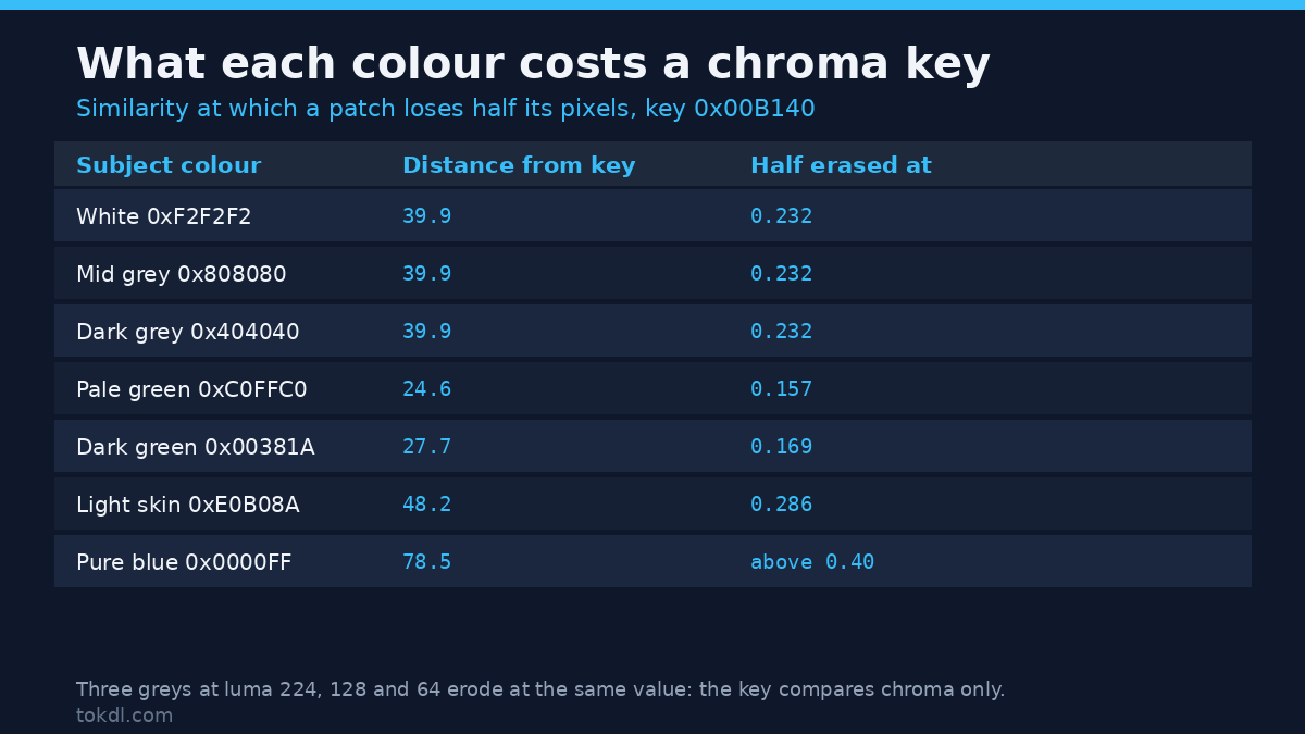
I tested that rather than trusting the manual. Three grey patches at completely different brightness levels (0xF2F2F2, 0x808080, 0x404040) were keyed against the same broadcast green. If brightness mattered, they’d need different tolerances, since their luma sits at 224, 128 and 64. They didn’t. All three started to disappear at exactly the same similarity, 0.232. The chroma key never looked at brightness.
That explains plenty of daily trouble. A silver garment keys badly, because neutral colours sit near the centre of the chroma plane and their distance from your screen is a matter of degree. A shadowed patch of screen keeps its chroma and loses only brightness, so it keys close to the lit part. Skin sits in the middle, carrying red-yellow chroma a moderate distance from green.
Here’s the arithmetic behind screen colours, using BT.709 coefficients. Chroma distance is measured from neutral, where Cb and Cr both sit at 128.
| Colour | Luma (Y) | Cb | Cr | Chroma distance |
|---|---|---|---|---|
| White 0xF2F2F2 | 223.8 | 128.0 | 128.0 | 0.0 |
| Light skin 0xE0B08A | 173.6 | 117.2 | 139.3 | 15.6 |
| Broadcast green 0x00B140 | 128.7 | 112.1 | 91.4 | 39.9 |
| Pure green 0x00FF00 | 172.6 | 84.8 | 77.1 | 66.7 |
| Pure blue 0x0000FF | 31.8 | 184.0 | 122.9 | 56.2 |
Pure green sits 66.7 units from neutral while blue manages 56.2, so green gives a chroma key more room to work. Blue’s luma is also a quarter of green’s, 31.8 against 172.6, which is the real reason blue screens fell out of fashion: you need about five times the light for the same exposure. For how bit depth feeds in, 8-bit vs 10-bit video colour depth goes deeper.
The controls that decide a chroma key
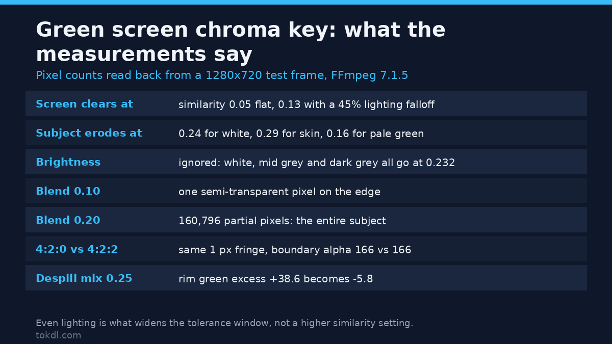
Similarity (tolerance) is how far from the screen colour a pixel can sit and still count as screen. Blend (softness) widens the band where pixels go partly transparent instead of yes or no. Screen evenness sets how much budget you spend before the chroma key starts eating your subject. Measured here:
| Control | Measured effect |
|---|---|
| Similarity | 0.05 cleared a flat screen; 0.24 erased the white subject |
| Blend | 0.10 made one edge pixel semi-transparent; 0.20 made the whole subject semi-transparent |
| Screen evenness | A 45% brightness falloff pushed the useful similarity from 0.05 to 0.13 |
Similarity is a budget, not a quality dial: spend too little and screen stays behind, spend too much and you eat your subject from whichever colour sits nearest green, greys first.
Measured: the window you’re working with
I keyed the same white subject against two screens. Against broadcast green, the chroma key cleared the screen from 0.05 and the subject began to erode at 0.24, so the usable window runs from about 0.05 to 0.23. Against pure green the subject held to 0.38, over 50% more tolerance, matching the chroma table: pure green sits further from neutral.
Then I added lighting problems, keying a flat screen and a screen with brightness falling off 45% from centre to corner, both with mild sensor noise:
| Similarity | Flat, screen left behind | Flat, subject kept | 45% falloff, screen left behind | 45% falloff, subject kept |
|---|---|---|---|---|
| 0.05 | 0.0% | 100.0% | 100.0% | 100.0% |
| 0.10 | 0.0% | 100.0% | 61.2% | 100.0% |
| 0.15 | 0.0% | 100.0% | 0.0% | 100.0% |
| 0.25 | 0.0% | 18.5% | 0.0% | 18.5% |
The second row is the trap in one line. On the flat screen you can key at 0.10 and lose nothing. With a 45% falloff, that same setting leaves 61% of the screen behind, and clearing it means pushing similarity to 0.13 or higher. The subject holds until 0.24, so the shot survives and you’ve spent 40% of your error margin covering lighting you should have fixed on set.
Subject colours cost different amounts, measured by bisecting the similarity at which each patch lost half its pixels against broadcast green. Pale green 0xC0FFC0 went at 0.157 and dark green 0x00381A at 0.169. White held until 0.232, and light skin 0xE0B08A until 0.286, while pure blue survived past 0.40. The nearer a colour sits to your screen’s chroma, the lower the similarity that destroys it. Grading before the chroma key moves those distances, so a grade applied first behaves differently from one applied after. If your footage came out of a flat log profile, converting log footage to Rec.709 gives you the reference you need to judge chroma at all.
Blend is not a softness knob
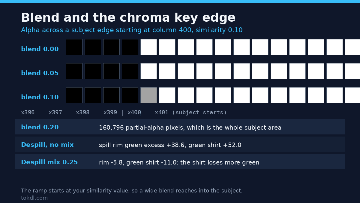
Blend sounds harmless. It’s sold as edge smoothing, so people nudge it up when the matte looks harsh. Here’s what blend does to a chroma key, read one pixel at a time at similarity 0.10, across a subject edge that starts at column 400:
blend 0.00   x396 x397 x398 x399 | x400 x401 x402 ... x411
               0    0    0    0  |  255  255  255 ...  255
blend 0.10    0    0    0    0  |  163  255  255 ...  255
At blend 0 you get a hard edge and a clean decision. At 0.10 exactly one pixel along the boundary goes semi-transparent, alpha 163, and the rest of the subject is untouched. Now the part that bites: the ramp starts at the similarity value, so raising blend widens the band of pixels that get partial alpha, and your subject’s chroma lives inside that band. At similarity 0.10 with blend 0.20 I measured 160,796 partial-alpha pixels, the entire subject area. It didn’t soften one edge, it made the whole person semi-transparent. The filter source says the same thing in three lines: alpha comes out as your distance minus similarity, divided by blend. Leave it at zero, and if the edge looks harsh, fix the lighting and your camera’s sharpening first.
Does 4:2:0 break a chroma key?
The familiar warning is that 4:2:0 footage keys badly, because the colour channels are stored at half resolution and your subject’s edge carries smeared colour. I tested it: one unencoded still, then the same frame encoded losslessly to H.264 at 4:2:0 and 4:2:2, then keyed with identical settings.
| Source | Boundary pixel alpha | Semi-transparent pixels across the edge |
|---|---|---|
| Unencoded still (4:4:4) | 163 | 1 per row |
| 4:2:2 H.264, lossless | 166 | 1 per row |
| 4:2:0 H.264, lossless | 166 | 1 per row |
Three alpha levels apart, same fringe width. On a flat, well-lit screen, subsampling didn’t widen the keyed edge at all. What it changed is the subject: the 4:2:0 version differs from the original in 790,400 pixels with a peak channel difference of 7 levels, while 4:2:2 differs in 785,600 pixels with a peak of 1. The cost lands on colour detail inside your subject. At 1920×1080, 4:2:0 keeps 1,036,800 chroma samples per frame against 2,073,600 at 4:2:2, and no chroma key can put back the half that was never recorded.
Spill and despill, with numbers
Spill is green light bouncing off your screen onto your subject, strongest at the edges. I synthesised it as a green rim decaying over about 6 pixels, keyed it, composited over a dark background, and measured green excess on the rim: the green channel minus whichever of red or blue is higher, so a neutral pixel reads zero.
| Despill setting | Green excess on the spill rim | Green excess on a green shirt |
|---|---|---|
| None | +38.6 (95th percentile +56) | +52.0 |
| mix 0.25 | -5.8 | -11.0 |
| mix 1.00 | -22.2 | -42.0 |
Two conclusions, and the second is the one people miss. A light despill already does the job: at mix 0.25 the rim fell from +38.6 to -5.8, so the spill is gone, while 1.0 drives the image green-negative, which is how skin picks up a magenta cast. And despill can’t tell spill from a green shirt: the pass that removed 44 units of green from the rim took 63 units off a genuinely green garment, dragging it from clearly green to slightly negative. If your shot has real green in it, restrict despill to the rim. In my run the interior stayed at -10.8 before and after, so a masked despill only touches what it should.
The same controls in your editor
In OBS the chroma key filter has Key Colour Type, Similarity, Smoothness and Spill Reduction, and since Smoothness is the blend control, keep it near zero. Resolve’s 3D Keyer gives per-pixel sampling and a Despill you can dial back on its own. Premiere’s Ultra Key splits the work into Matte Generation, where Tolerance is similarity, and Spill Suppression. CapCut keeps two sliders, intensity and shadow. Learn which slider is similarity, and the rest is the shot. Keying 4K on a laptop? Keep the chroma key for the final render and edit on proxies, as proxy files for video editing explains.
Reproduce every number yourself
The subject is a single still, so this is quick. Build the test screen:
ffmpeg -f lavfi -i "color=c=0x00B140:s=1280x720:d=1:r=1"
 -vf "drawbox=x=400:y=200:w=400:h=400:color=0xF2F2F2@1:t=fill,
drawbox=x=500:y=240:w=200:h=120:color=0xE0B08A@1:t=fill"
 -frames:v 1 green_key_source.png
Then key it and read the alpha channel back, the most useful habit in this process because it turns “the edge looks off” into a number. This dumps one row of pixels as four numbers per pixel, red green blue alpha:
ffmpeg -i green_key_source.png -vf "format=yuva444p,
chromakey=color=0x00B140:similarity=0.10:blend=0.10"
 -frames:v 1 -f rawvideo -pix_fmt rgba keyed.rgba
od -An -tu1 -v -w4 -j 1537584 -N 32 keyed.rgba
The last number is alpha: the screen reads 0, the subject 255, and the boundary pixel at column 400 reads 163, the one-pixel fringe measured above.
Check what despill does to your own colours first:
ffmpeg -i your_frame.png -vf "format=rgb24,
despill=type=green:mix=0.25" despilled.png
Both filters are documented on the FFmpeg filter reference, and the comparison logic sits in the filter source, It’s about sixty lines, and it’s why brightness never entered any measurement above.
Common mistakes, in the order they cost you
- Raising similarity to kill the last bit of screen. That leftover is lighting at the frame’s edge.
- Using blend to soften a harsh edge. At 0.20 it eats the whole subject.
- Pulling the chroma key before you grade. Unconverted log footage isn’t the chroma you’ll deliver.
- Leaving despill at maximum. Spill is gone by 0.25; the rest damages real green.
- Judging the matte at fit-to-window size. The fringe is one pixel wide.
FAQ
Why is green better than blue for a chroma key?
Two measured reasons. Pure green carries a larger chroma distance from neutral than blue, 66.7 against 56.2, and its luma is 5.4 times higher, so a blue screen needs far more light. Green also sits further from typical skin and hair chroma, so less of your subject gets eaten.
Does recording in 4:2:0 ruin a chroma key?
Not the matte. On a flat screen, 4:2:0 and 4:2:2 keyed with the same one-pixel fringe and boundary alpha within three levels. The cost is colour detail inside the subject, at half the chroma samples per frame.
What similarity should I start from?
Start low and walk up until the screen clears, then stop. A flat screen cleared at 0.05 here, one with 45% falloff needed 0.13, and the white subject held until 0.24. Past 0.20, fix the lighting.
Conclusion
A chroma key compares chroma, ignores brightness, and hands you a budget of tolerance to spend. Everything that goes wrong on the timeline traces back to that budget: an uneven screen spends it, a wide blend spends it, a raised similarity spends it, and despill takes a little of your subject’s colour along with the spill. Set up the screen so the budget is wide, check your edges once at 200%, and read the alpha plane instead of guessing from the preview. If you’re still tuning the rest of the pipeline, how to choose the right bitrate is the natural next step, because a heavily compressed master makes every matte problem look worse.